
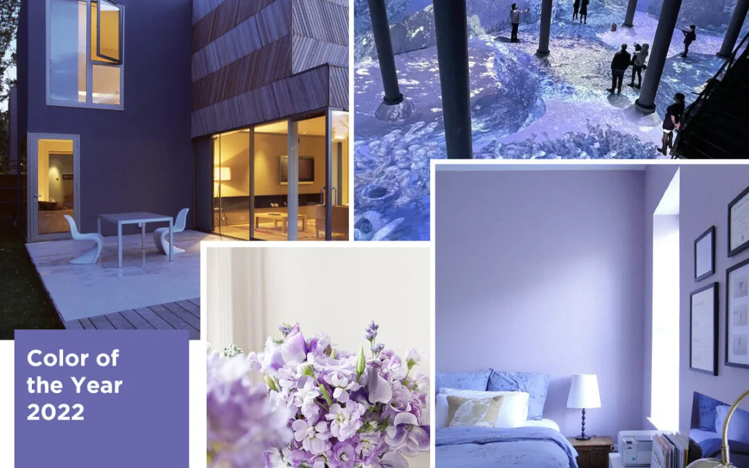
If this warm, yet cool color reminds you of Monica Geller’s door from Friends, you aren’t the only one. That was the first thought I had as well when I saw Very Peri, the Pantone Color of the Year 2022.
This dynamic periwinkle blue hue with a vivifying violet-red undertone is a combination of two primary colors. Yet Very Peri (Pantone color code 17-3938) is a brand-new shade that has sent the design community into a creative drive. And why not! This joyful color has been selected to represent just that: renewed energy to overcome one of the most difficult times faced by mankind.
In 2021 we had two Pantone Colors of the Year, Ultimate Grey and Illuminating Yellow, which represented the ambiguity of the times we were in. Something about Very Peri, as a shade, is very hopeful and forward-looking. Rooted in the classic traditional blue, which represents constancy, and energized with the passion and excitement of red, Very Peri is just what we need. And despite its boldness, this color can be used in designs from graphics and animation to interiors and even architecture. Let us look at what our team of expert designers has to say about Very Peri.
What is the first word that comes to your mind when you see the Pantone Color of the Year 2022?
Nikita: Whimsical
Aditi: Lavender
Sakshi: Lavender. It also reminds me of a top I had when I was a kid which stretched with me as I grew older 😀
Shweta: Pastel Purple; Wisteria (in Japanese trees)
Snehal: Luxury
Amisha: Purple
Vedshree: A friend who likes this color a lot.
How does the color make you feel?
Nikita: This color makes me feel optimistic. It makes me want to push boundaries creatively. It has a sense of duality about it – while it has a sense of boldness and playfulness to it, this color also seems quaint, exuding a sense of calm.
Aditi: Calm; reminiscing of a field full of flowers.
Sakshi: As it reminds me of lavender, it automatically reminds me of the smell of the flower, so I feel relaxed.
Shweta: To me, it depicts elegance; gives a classic vibe. It feels very light and airy.
Snehal: It makes me feel creative. The color has a relaxing and soothing effect on both mind and body. It is the best choice for peaceful, quite décor and clothing.
Amisha: This color gives a feeling of royalty, luxury and a sense of calm and peace.
Vedshree: Vibrant; it gives a smooth, lively feel.
How would you incorporate Very Peri in your designs (architecture, animation or graphics etc.)?
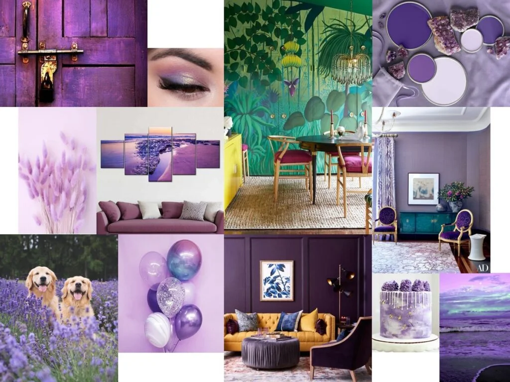
Nikita: In interiors, as a textured accent wall, or as a pop of color in furniture to break the monotony in spaces. It can also be used in styling & decorating- wall decor pieces, table runners, rugs, and other props against the backdrop of white, beige and brown undertones.
Aditi: In architecture, as a monochromatic installation.
Sakshi: I would use it as an exterior finish for multifamily buildings.
Shweta: I would incorporate it in graphics by pairing it with more vibrant colors from the Pantone color palette to give a visual experience of sophistication yet fun.
Snehal: It can be dramatic or quiet, depending on the texture or the room. The regal color can add richness to a large space or drama to a simple room.
Amisha: I would love to incorporate this color in interiors. Use it to paint it on the wall to highlight certain areas, to create dominance.
Vedshree: As a piece of furniture or an accent-painted wall.
If you had to add Very Peri to your home décor, where would you add it?
Nikita: I would add this color to wall murals as part of my home decor.
Aditi: As a statement piece on the table.
Sakshi: I would use it for linen or plant pots.
Shweta: In the drapes.
Snehal: I would add this color to the ceiling with all walls in white color.
Amisha: I will add this color to my living room wall behind the seating.
Vedshree: A blank wall; I will probably add texture to it.
What are some of the colors, textures, fabrics, fonts, materials etc. you think will pair well with it?
Nikita: Hues of white, beige, lighter shades of brown for space decor. In the case of digital art, pair it with high contrast colors like yellow etc.
Aditi: A white jute & hemlock wood.
Sakshi: White, black, and shades of brown, yellow and orange would go well with this color.
Shweta: Gold and white.
Snehal: I will pair the color with shades of cream and white from the Pantone color chart.
Amisha: I would like to pair it with pearl white color, teak wood (dark) and bird feathers.
Vedshree: Yellow and green.
With the Metaverse, NFTs, virtual office spaces and online meetings, the lines between our digital and physical worlds have blurred. We are learning to seamlessly transition from the virtual worlds that we inhabit, to the physical world we live in. With its roots in natural colors of spring blossoms, yet its infinite possibilities in the virtual realm, Very Peri is here to inspire a new vision of 2022 as the Pantone Color of the Year.
This is the first time the company has created a new shade for the Pantone Color of the Year program. This is in line with the innovation and digital transformation that is taking place globally. “As society continues to recognize color as a critical form of communication, and a way to express and affect ideas and emotions and engage and connect, the complexity of this new red violet infused blue hue highlights the expansive possibilities that lay before us.” added Laurie Pressman, Vice President of the Pantone Color Institute.